Increasing usability by reducing complexity
OAPRA partnered with us to improve their site—as well as their own workflows and load management—via an experience that would enable users to more easily navigate these complex processes.
Working inside the box
Gettin’ jigsaw-y with it

Saved by IA
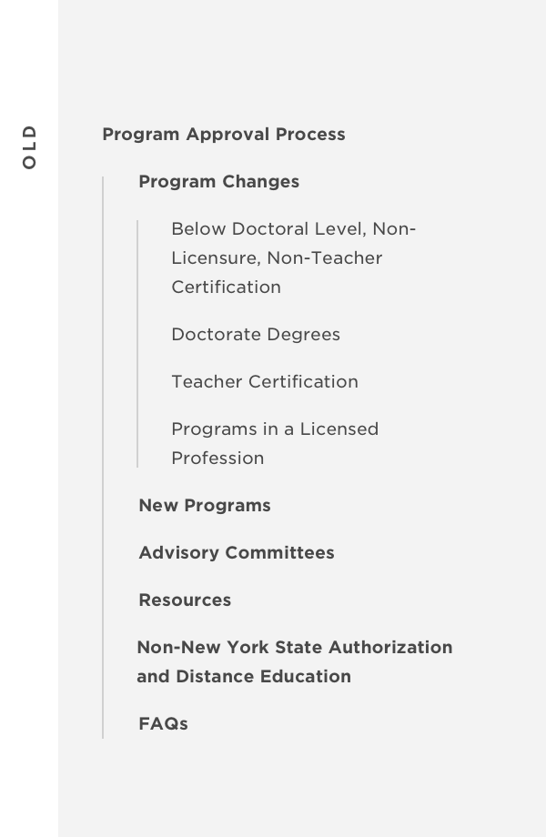
Our discovery process included a benchmarking survey of real users. The data showed that confusing pathways, jargon-y labeling conventions and poor content design caused user frustration. Nearly identical content across the site further hindered usability. And a complete lack of contact information made it even more difficult for users to achieve their goals.
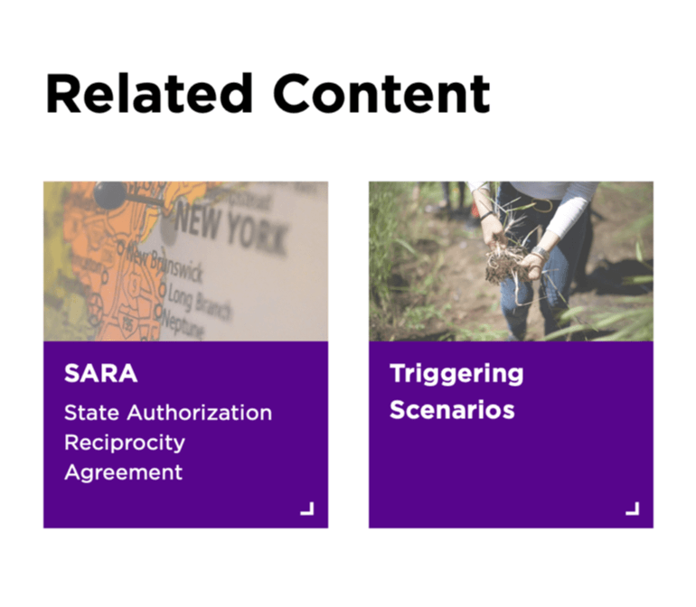
So we re-architected around rational user pathways and understandable naming conventions. From the overall site name down to the deepest content pages, we ensured that our new IA and labeling conventions mapped to a user’s journey of requesting and discovering pertinent info.
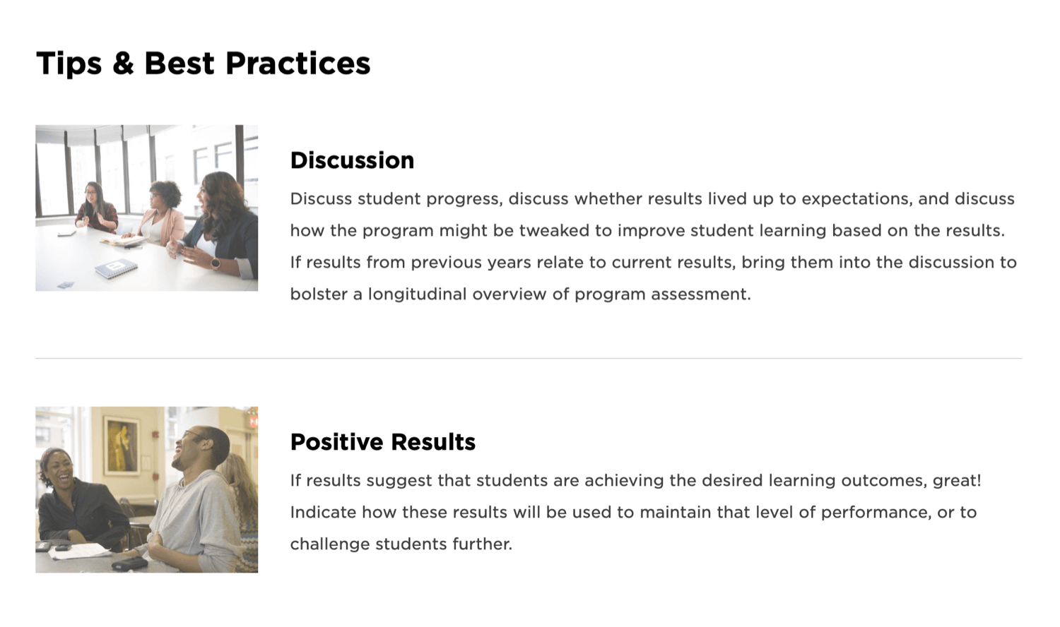
Content design delivers
We extensively reworked the design of content detailing the processes for adding or changing a program—a key function of the site, and one of its most complicated. We designed a visual checklist of guidelines that were specific enough to be accurate and useful, yet general enough to remove the need for caveats and slight variations.
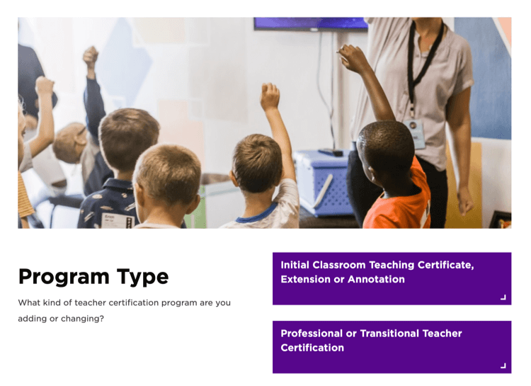
We then redesigned the pathways following a general-to-specific progression. A user first identifies a level of study for the program they wish to add or change, then whether any specific considerations are required, then finally whether they wish to add or change that program.
This boosts a user’s confidence in their journey and ensures that it ends on a page tailored to their specific needs.